Painting St Porphyrios (On Emotional Manipulation and Black Garments
"St Porphyrios has the most difficult face to paint". These were the words of iconographer Fr Justin Venn when I started work on this icon of St Porphyrios....and I wholeheartedly agree. There are not many photographs of him and it seems that in every photo he looks different. So most iconographers fall into the trap of painting is face like a naturalistic portrait collaged onto a byzantine body. So I almost have a sense of dread when someone commissions an icon of him and especially when they say we want his face to look like this or the other icon and for him to be smiling etc. Inevitably the icons they have sent me show a naturalistic portrait-like face. This means having to explain what I did in the previous post on St Sophrony.
Besides the matter of the naturalistic face is the matter of wanting the saint to be depicted smiling like he is in his photographs. The icon is not supposed to show any emotion, it is not meant to influence or manipulate our feelings in the way that Western art does from the Renaissance on. Once the western image lost the ability to create a relationship with the viewer by projecting the figures into the same time and space as the viewer, the only way left to create a connection was through sentimentality, through manipulating the emotions. The Byzantine icon doesn't do this. Rather it leaves the viewer free to enter into the relationship or not. I have written in more depth about this subject here (Revisiting the Patristic Theology of the Icon Part 1: Setting Aside our Western Assumptions)
Another difficulty we face when painting contemporary saints is black garments. Byzantine iconography is essentially colour given form and hypostasis by line. The whole byzantine painting language is based on the contrast between warm and cool, dark and light colours. There are no black garments in Byzantine or post-Byzantine iconography, but now we are faced with contemporary saints who wear contemporary black clerical dress and the expectation to paint them that way, which most often results in dead lifeless garments. So how can we paint black garments without them looking dead and lifeless? By painting them in color. I will explain the process below.
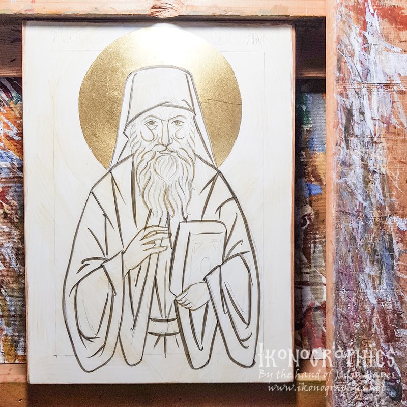
So for the initial preparation to paint this icon I found a frontal photograph of St Porphyrios with a fairly neutral expression on is face and where his eyes aren't squinting from the sun or a smile and I overlayed the line-work for the icon, finding the form of his beard and trying to create a sense of rhythm.
I then made a rough sketch based on those forms.
Then I sketched the icon onto the panel.
After gilding the halo I paint over the basic forms using black and yellow ochre.
I paint the initial layers for the background so I can see how the colours work together while I'm painting. I chose a red background so that will contrast with the cooler "black" of the garments and make them more alive.
I cover the garments with a dark olive proplasmos made of black and yellow ochre. In other icons with black garments I have used different coloured dark proplasmos for the different garments, but here, I'm sort of "breaking the rules" because of the intense warm red background, and not using a warm background for some of the garments.
I then build up the grapsimata and dark areas with the addition of black to the proplasmos. Already we can see the figure is beginning to contrast with the background.
Now with the addition of white and a tiny bit more black to the proplasmos we have a cool bluish colour with which I build up the lighter layers. The proplasmos is actually warm in relationship to the lighter blue layers and this helps project the form and also make the black colour seem more alive.
Here I have completed the Gospel book and belt and have laid down the proplasmos for the face and hands (yellow ochre, ercolano red and black).
I then start building up the grapsimata and details on the face, beard and hands with red ercolano and black
I create the grey for the beard using the proplasmos for the face plus black and white and first lay down a glaze before building up the forms.
Then with the addition of white I build up the layers of the forms, each layer being smaller than the previous one,to create the sense of volume that projects the forms off the surface and towards the viewer.
The final white highlights are only added on the broader side of the face which projects towards the viewer.
Now I start building up the flesh tones with yellow ochre and white.
Each consecutive layer that is built up with the addition of white creates the volume and plasticity of the face.
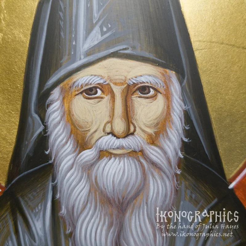
And now to bring the face to life I add a cool glaze which is blended into the proplasmos on the broader side of the face which helps project towards the viewer (white, yellow ochre and black). On the narrow side of the face as well as on the lower lip, cheeks and nose I add a warm glaze. This contrast of warm and cool suddenly brings life to the face that seemed quite flat and lifeless.
I continue building up the flesh with another layer with the addition of white. Here you can see that when the face is in the dynamic frontal pose (where the head moves in one direction, and the gaze in the opposite direction) now matter where you stand in relation to the icon the person depicted will be looking at you.
Finally we paint the psimithia with the addition of more white.
The final white psimithia are only painted on the broader side of the face.
Are you interested in learning Byzantine Iconography? Learn more about my tutorial on Patreon and Udemy:
Would you like to commission a hand-painted icon?
If you enjoy my content consider buying me a cup of Kofi: https://ko-fi.com/ikonographics


